
Illustrator Shirley Willis Salariya shares the stories behind her work
From lively children’s books to beautifully detailed illustrations, Shirley Willis has left a lasting mark on young readers. In this blog, Shirley takes us behind the pages of her works, sharing the inspirations, challenges, and hidden details that shaped them. With decades of experience in illustration and storytelling, she reveals the creative process behind her art, ‘spilling the paint’ on how these books came to life.

Shirley Willis
Shirley Willis was born in Glasgow, and her art education began at Glasgow School of Art. Shirley’s work has been exhibited in the Compass Gallery in Glasgow, the Scottish Royal Academy, the Aberdeen Gallery,and the Stirling Gallery. Her skillset encompasses writing illustration, printmaking, painting, stained glass and also silversmithing.
Today, I have the pleasure of interviewing Shirley Willis, who is not only a multi talented artist and author but also Shirley (Willis) Salariya -'the divine Mrs S'- and co-director of the children's book publisher: The Salariya Book Company for thirty-three years. Our conversation about Shirley's work touches on the ups and downs of working freelance, and also includes the story behind some of her work which has found its way onto walls or into books through her long career and she'll show us the working process behind some pieces where pencil roughs show how a project starts to come to life.
A Change in Direction
Shirley's art career has not been a linear journey. Having chosen to specialise in murals and stained glass at Glasgow School of Art, she changed direction by shifting her focus to illustration and printmaking instead. This led her to Duncan of Jordanstone College of Art in Dundee, where we met and now have been together now for a very, very long time!
Throughout her publishing career Shirley has worked in a variety of styles for different types of books, and always embraced experimentation in illustrating, printmaking, stained glass work and more recently her work in silver.
Let's look into the work that has shaped
Shirley's career.
Life Drawing


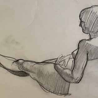

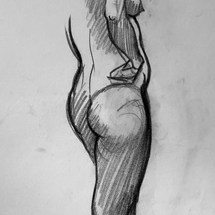

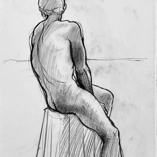

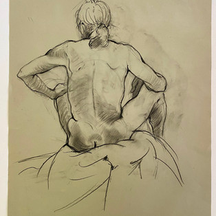
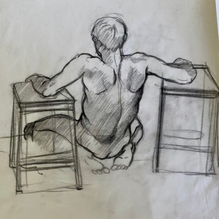

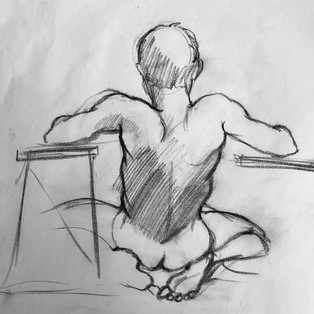


Life Drawing - Light Source Defines Form
You are very comfortable with a pencil. Your drawings are fluid and confident, with a strong tonal range...to my great envy. How do you balance your love for the intuitive, free-flowing nature of drawing with the more rigid constraints of professional illustration, especially when your first freelance jobs involved stipple work — where, as you put it, 'the dot stopped walking'?
I love drawing with a soft, dark pencil. Adding tone gives weight and presence to a life-drawing or portrait as a strong light source defines its form. Starting with a quick set of sketches helps you to loosen up before you draw a longer pose. I'm not precious about the end results, some you win, and some you lose and bin — unless, of course, you're David Hockney, whose bin would be a rich source to rummage through!!!
I like the feel of pencil on paper and have a natural leaning towards line, whether in life drawing, illustration, or etching. As an art student, I loved the artist Paul Klee's famous quote describing line as...
“A dot that went for a walk"
Editorial Constraints
However, transitioning into professional illustration, I quickly realised it was to be far from the intuitive freedom that Klee’s quote celebrates. The commercial world operates on a completely different wavelength and producing illustrations for clients, particularly in publishing, meant creativity now had to function within editorial constraints. As my first freelance job required stipple drawings — 'the dot stopped walking’ and came to a complete halt!

Etching - A Printmaking Process
As seasoned writers for children - where we never assume knowledge - it would be good to explain what an 'etching' is.
Etching was developed from Armour-making
Etching was developed from armour-making in the 14th and 15th centuries and it only became an art form later. Rembrandt produced 100's of etchings, and dry points throughout his life. Etching is a printmaking technique where acid is used to create an intaglio image on a metal plate - typically copper or zinc.
Acid Bites into the Exposed Lines in the Metal Plate
The prepared plate is first coated with an acid-resistant ground. You draw on it using a sharp tool so it cuts through the ground, exposing the metal underneath — the lines you want to etch. It is submerged in a bath of acid which ‘bites’ into the lines of exposed metal and creates an intaglio image. The plate is inked-up and the surface wiped so the ink only remains in the etched lines to print the image onto paper. A series of prints (an edition) can then be produced. An edition number is marked on a print; the etching below titled 'Disregard…' was an edition of six prints and is marked 3/6.
'Health and Safety'- What's That?
Throughout my years at art school, 'health and safety' was an unknown term. Printmaking students generally hung over the acid baths checking the 'bite' and inhaling all manner of noxious fumes — before the advent of extractors, masks and safety was ever considered.
‘DISREGARD... ' Etching
In this etching, 'Disregard...', I used a hacksaw to cut around the heads in this etching plate to emphasis and create an, embossed triple-headed shape. The Spanish artist Salvador Dali is clearly the inspiration for this etching’s ‘sofa lips’. The lips were deeply etched into the plate to present a fleeting and convenient 'stopover' for the passer-by who conveys the shallow emptiness and ephemeral nature of non-interaction through his disinterest and complete disregard for those around him.

'Dreams of Lost Horizons' Etching
Etching, 'Dreams of Lost Horizons', was an attempt to capture the emotional landscape of displacement — a sense of yearning for a lost homeland. The image shows a man in a fedora gazing beyond a rim of primitively-shaped animals, with memories unfolding and lingering in his mind's eye. As the head and hat are etched deeply, ink gets partially wiped from these areas which creates a dreamy quality to his expression.

'Jack in the Box'
Etching 'Jack in The Box' explores the drive to break free from confinement. The etching shows a head with giant hair follicles erupting from the skull to symbolise emerging thoughts and ideas. The large arrows present different directions and potential choices. The velvety blacks are created by a mezzotint rocker tool used to roughen the entire area so it holds the maximum amount of ink to make a deep, solid black.

'Egress' Etching
This etching, ‘Egress’, an image of an Egyptian Pyramid with a zipper opening, symbolises the looting of Egyptian antiquities. I cut and shaped this plate, too, for added interest. Built as pharaonic tombs, most pyramids were robbed in antiquity. Although influenced by the treasure trove found in Tutankhamun’s tomb, the Ancient Egyptian artefacts that exit this zippered pyramid are an eclectic selection from a wide timespan and generally represent the extensive 'looting’ by archaeologists rather than the original tomb robbers.

'There Was an Old Lady...' 12 Illustrations drawn in black ink
An art school project to draw and produce a printed calendar.
A series of ink drawings, one for each month of the year, were bound into a calendar.
Beatrice Corbett Salariya, the subject in each of the drawings for ‘There was an Old Lady…’, forms the thematic core that links the calendar together. A simple square is used to reflect months when ’the Old Lady' is inside, looking out — as shown in January's drawing of heavy raindrops falling from storm clouds overhead, or in March where her hand reaches out to pick a crocus as 'Mad March Hares' leap across the foreground.
‘There was an Old Lady...’ January, March and November


Pen and ink drawings
I used a dip pen and ink for these drawings, relying heavily on good luck to avoid unintentional splatters or drips. Were I doing a similar project today, I'd probably embrace any random marks as they can often add life to an image. Each drawing was printed with its month and number of days. All twelve drawings were then ring-bound together along with a front cover embossed with the title,'There was an old Lady...'.

Art school project:
Choose a subject to illustrate, typeset and print as a small book.
'One Flew Over The Cuckoo's Nest' by Ken Kesey
I chose to illustrate excerpts from Ken Kesey’s richly inspiring ‘One Flew Over the Cuckoo's Nest’. It was an excellent book, as was Miloš Forman’s film adaptation. The restrictive psychiatric hospital setting showcases a range of vulnerable characters, and crises. The clash between Nurse Ratched's cruel and manipulative control, and McMurphy's exuberantly defiant spirit, highlights the tension between sanity and lunacy. McMurphy fights to overturn the nurse's oppressive rule, seeking freedom and individuality for his fellow inmates.
Hand-setting the text with letterpress
Kesey’s richly descriptive language was perfect to quote and illustrate. Once the pencil drawings were complete, the production side of preparing a book for print began. Although only a 24-page book with short quotes, it took an extraordinary amount of work. The text had to be hand-set with letterpress, each letter set in reverse for printing. The pages were then guillotined and stitched into small books. Though the production was challenging, it clearly delivered the project's message: How to make a book!


'School Leaver' and 'Which Course?'
1980's Career magazines. Publisher: Dominion Press
These monthly magazines, aimed at school leavers, introduced a wide range of possible carreer choices that included anything from blacksmithing, carpet designing, nursing, catering, performing arts and many more. Each month, the magazine sent me the lead article that was to feature on the front cover and I was given complete freedom to design the artwork for it which was quite unusual. It wasn't a particularily lucrative job but I rather enjoyed the freedom it offered, and produced cover artwork for them for about two years.


Your first freelance work for Dorling Kindersley and Reader's Digest involved the brain-numbing/painstaking process of stipple drawing. How did you manage such a time-intensive technique, and how do you feel about how technology, like Photoshop and AI, has transformed the process today? Also, what was it like illustrating artefacts from the Mary Rose and visiting the conservation site?
Dorling Kindersley and Readers Digest
My first freelance work in the 1980s was for Dorling Kindersley and Reader's Digest. The art directors of both publishers wanted stipple drawings — detailed images created out of ink dots. Stippling was an extremely laborious and long-winded way to draw an image but — it was the style required, and it paid the rent. Needless to say, computers didn't exist back then — nor did the internet. A couple of decades later, Photoshop could achieve the same effect in a fraction of the time. And now, AI can generate stippled images within seconds with precision, accomplishing tasks that took hours to complete by hand —showing how fast technology has advanced and completely changed the way we work.
‘The Story of the Mary Rose’
By Ernie Bradford (Publisher: Hamish Hamilton)

When asked to illustrate artefacts recovered from the Tudor ship, Mary Rose, I was absolutely delighted. Unfortunately, they wanted stipple drawings, too! But it was a great opportunity - despite the endless dots that lay ahead - because the job entailed visiting the conservation site which housed many objects collected long before the sunken hull was raised in1982. I clearly remember the ‘thrill’ factor on my first visit of walking past a series of stacked crates filled with Tudor femurs, skulls and other skeletal remains!

We worked on the History as Evidence series. Can you share your process of creating historically accurate illustrations for this series, particularly how you balance the need for authenticity with keeping the artwork engaging for young readers? Also, how did your collaboration with experts like Prof. Rosalie David at Manchester Museum influence your work, especially on the Egyptian title?
Historical Reconstructions For Children's History Books
‘Domesday Book’ (Publisher Kingfisher)
‘History as Evidence’ series (Publisher Kingfisher) Ancient Greece, Romans, Ancient Egypt, Prehistory, Vikings.
Reconstructions become an invitation to 'time travel' into history.
Historical reconstructions artwork require accuracy, so each project starts with research to understand its historical period, culture, and events before you even think about drawing. The illustrations need to be informative, but they need to be interesting too — so they'll draw young readers in and become an invitation to 'time travel' into history. Often, it’s the inclusion of small, unexpected details you unearth from research, or the way a scene is presented by experimenting with perspective to create surprising and exaggerated viewpoints.
Manchester Museum: Egyptian Mummy Research Project
Prof. Rosalie David was the author of the Egyptian title we were illustrating for the 'History as Evidence’ series. As an Egyptologist specialising in biomedical Egyptology at Manchester Museum, she invited us to meet her there. Our visit was particularly enlightening as she spent a great deal of time showing us around the Egyptology department. Her work at the KNH Centre for Biomedical Egyptology and the Manchester Egyptian Mummy Research Project is fascinating.
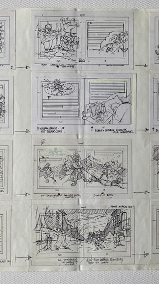
Pencil Roughs - Check for Historical Accuracy and Authenticity
Once completed, detailed roughs are submitted to the author or consultant to be checked for historical accuracy and authenticity. The approved roughs are then drawn onto paper or board, then drawn over again in ink before colour is added. The downside of this
three-staged redrawing of each image is that it tends to strip the final artwork of some of the vitality of the early roughs.


Illustration for Children's Non-fiction Books
A career in historical reconstruction illustration for children's non-fiction books is creatively fulfilling and intellectually stimulating because it opens up a myriad of opportunities to learn about different historical periods. Always be eager to learn and explore new historical periods and artistic techniques. Engage with peers, educators, and historians to get constructive feedback on your work.
Illustrating Picture Books for Children
My first venture into children's picture books would not make the top 1000 searches for 'children's fairy tale books,' 'mythology stories for kids,' or 'fairy stories for children. I am sure the author has even forgotten that this book exists - the illustrations were commissioned by Adrian Sington, the editor at Kingfisher Books, for 'A Book of Myths and Legends’, being written by an unknown author at that time - Anthony Horowitz.
Myths And Legends - Anthony Horowitz


Guinti Marzocco
You illustrated two books for the famous Italian publisher Giunti Marzocco: 'Tante Fiabe per Giocare' and 'Segreta Della Felicita'. What was it like working on these Italian fairy tales?
Giunti Marzocco are based in Florence and are the original publishers of Pinocchio, so I was highly delighted to be asked to work for them. 'Tante Fiabe per Giocare' was a collection of classic Italian fairy tales retold by Marcello Argili. None of the stories resembled any fairy tales I already knew. I'd also guess that in the retelling of these stories, Argali probably added his own quirky, modern twists which made them really novel to illustrate.
Can you share more about the stories and how you approached illustrating them?
Both books required line drawings, and colour plates. I was working in a slightly ‘blinkered' way — relying on very rough translations to grasp the gist of each storyline's wonderfully imaginative, and often surreal ideas. The 'Tante Fiabe’ fairy tales included a super-thief who steals a slice of sunset; a cemetery for old, forgotten fairy tales; a knight who bought a car to save galloping for seven days and nights to reach his princess; a dial-a-fairytale story phone service, a fairy tale that was eaten, and many more.
In 'Segreto della Felicita’, characters like Pinocchio’s father Geppetto, Alice in Wonderland, the Little Mermaid and others step out of their books at night to chat because they’re bored living in their own stories all the time. Some of the characters set off and create a brand-new story. It’s easy to see how these kind of ideas were inspiring for an illustrator.
I really like the idea of the Fairystory characters having a wander through the book and visiting other stories! These stories really resonated with you, didn't they
Yes - it was great fun to illustrate them and, of course, it was an honour to work with Giunti Marzocco.


Enid Blyton's 'The Night The Toys Came To Life'

Can you tell me about your experience illustrating Enid Blyton's The Night The Toys Came To Life and how you approached bringing her characters to life visually? Also, how do you see Blyton’s work in the context of modern storytelling, especially compared to something like Toy Story?
'The Night The Toys Came To Life'
'The night the toys came to life’, first published in 1943, had its own line-up of toy characters. I had great fun developing my visual ‘take’ of the book’s characters and took the opportunity to add some ‘extras’ of my own that integrated and worked well together. Most illustration deadlines are tight and you never, ever have as much time as you need or want — which included this book. To make matters worse, we were in the midst of moving house at that time — luckily only two doors down — so my desk and I were practically wheeled from one house to the next as I continued working!
Enid Blyton: Simplistic, Repetitive, and Intellectually Unchallenging
Blyton was one of the most prolific children's authors of the 20th century, from the 1930s onwards. But, by the postwar years, her books faced controversy due to literary criticism and social and cultural shifts, which caused her popularity to decline, particularly in the 1950s. Blyton’s writing was judged to be overly simplistic, repetitive, and intellectually unchallenging for children. However, many children and parents loved Blyton's books, and she returned to popularity again in the 1960s. Her books sold over 600 million copies worldwide.
A Precurser to 'Toy Story’?
Blyton’s 'The Night the Toys Came to Life' could be seen as a precursor to Pixar's 'Toy Story', but the context and execution of these ideas differ significantly. Blyton focused more on the joy and mischief of toys coming to life. 'Toy Story', by comparison, explores themes of friendship, loyalty, and the toy’s fear of obsolescence. It adds modern complexity to the concept by expanding it in ways that reflect a more contemporary storytelling style.


The Adventures of The Tooth Fairies was such a brilliantly creative project with a fun 'good vs. evil' storyline and even the potential for stage adaptation. How did it feel developing the characters and seeing so much enthusiasm, only for the project to never get off the ground? And how do you handle the disappointment of ideas that don’t make it past the drawing board as a freelance artist?
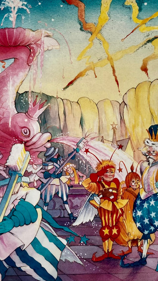
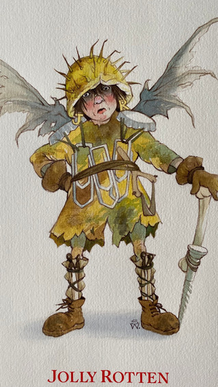
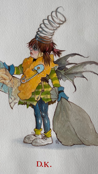
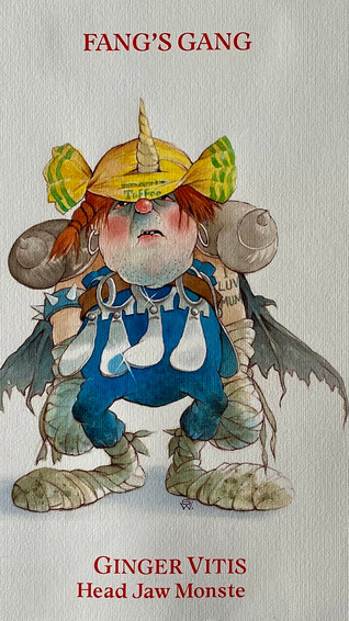
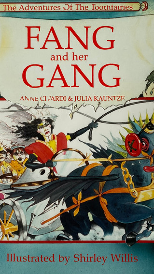
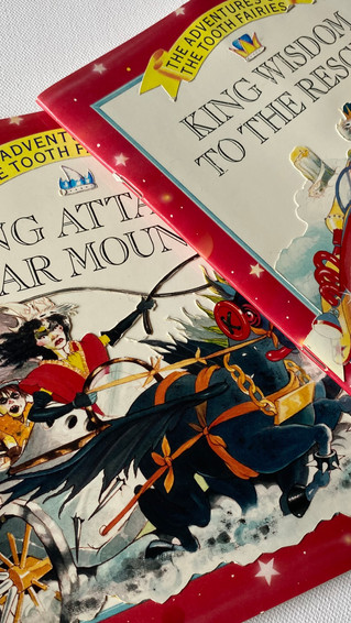
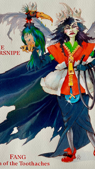
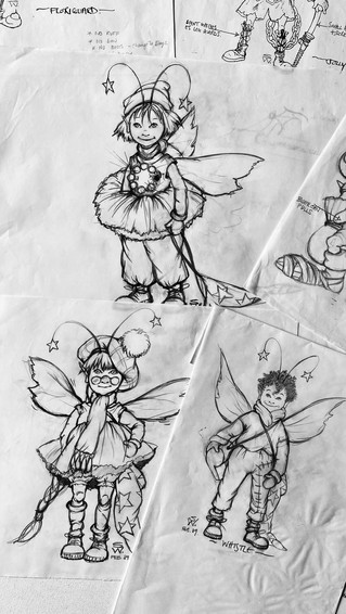
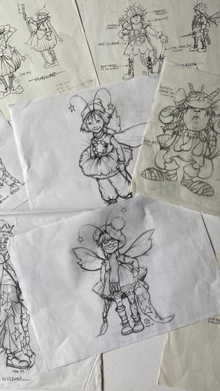
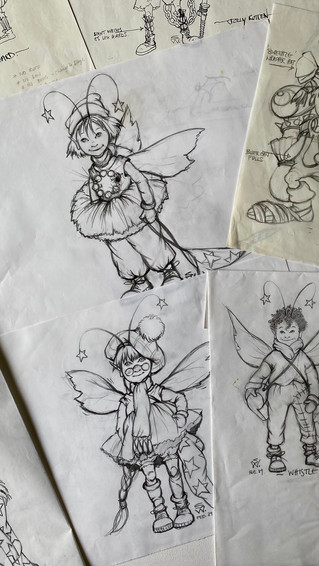
'The Adventures of The Tooth Fairies'
The Tooth Fairy story was jointly conceived by Ann Civardi and Julia Kauntze who had approached and established the interest of Tony Cobb, Art director at Mitchell Beazley publishers. It was essentially a ‘goodies’ vs ‘baddies' story. The ‘good’ tooth fairies aspired to light the night sky by polishing up the baby teeth they collected to make them into new stars. The ‘bad’ tooth fairies, wanting to bring an end to the ‘goodies’ and their starlight, went in for industrial sweetie-making to create decayed, cavity-ridden teeth to fire at the stars to destroy them.

Tooth Fairies...on Stage?
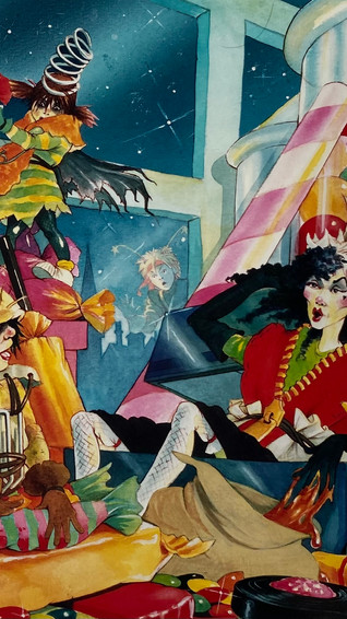
There was quite a cast of characters to visualise and, as the idea also had ‘rumbling aspirations’ of development for the stage - I found my ideas were veering towards costuming, too.
Presentation Pencil Roughs and colour artwork


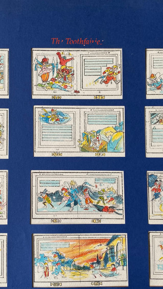


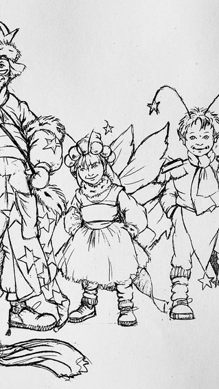

An Idea with High Hopes?
The final character line-up, along with a range of finished spreads and book covers was greeted with much enthusiasm but — it was an idea with high hopes that never got far from the drawing board. It was great fun developing the characters, particularly 'Fang’s gang of baddies’. Had the idea taken off I think I’d probably have adapted some costume details to simplify the illustration process. Defeat, for whatever reason, is never easy to accept, but it's an inevitability that freelance artists must simply learn to accept and move onto the next job.
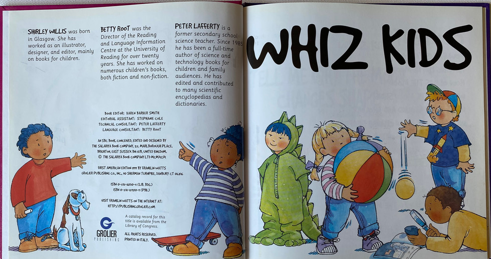
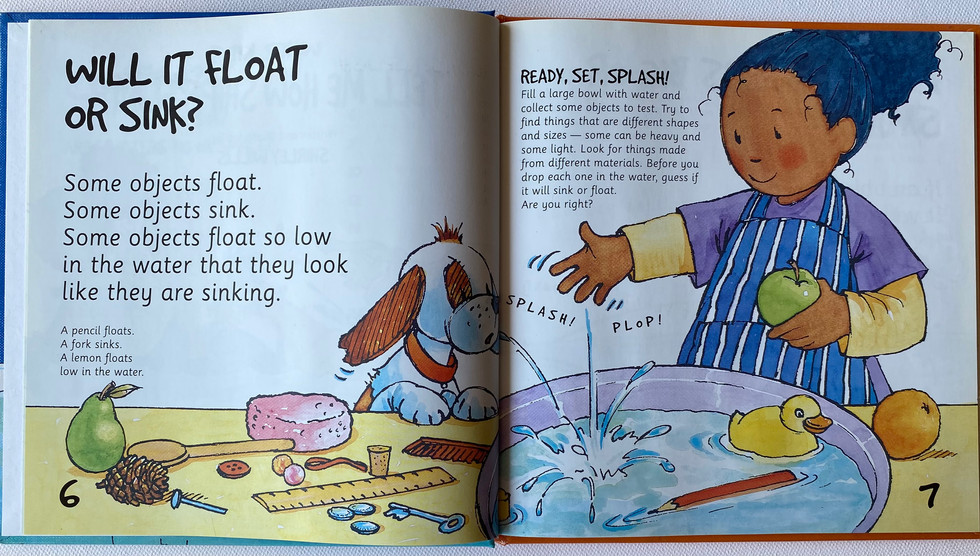
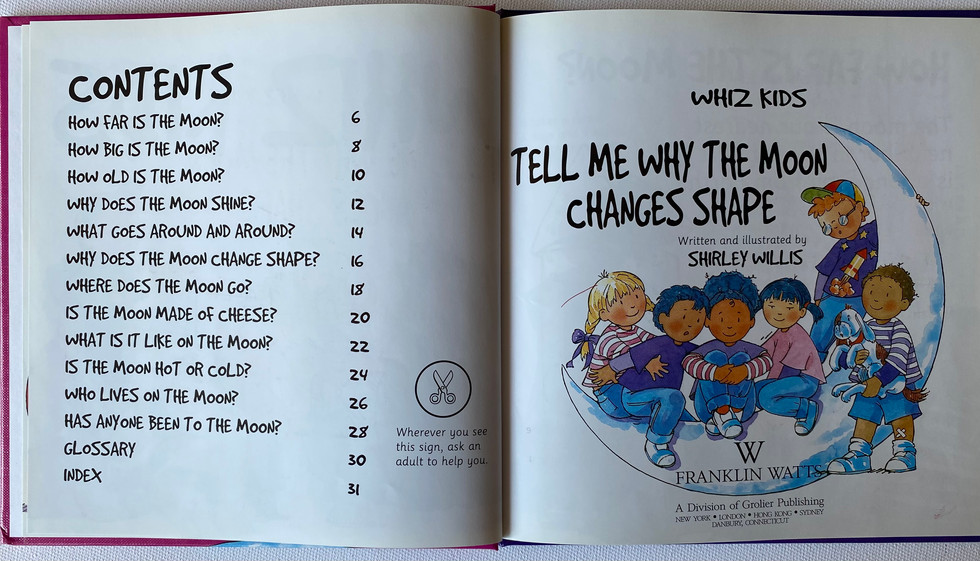
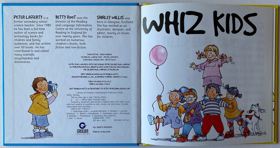
In1999, you started to write and illustrate the Whiz Kids series, introducing multiple early science ideas to young readers. Can you tell us more about this series and how it came to be?
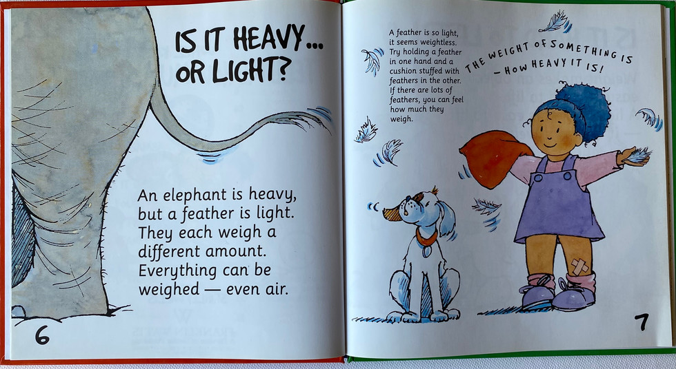
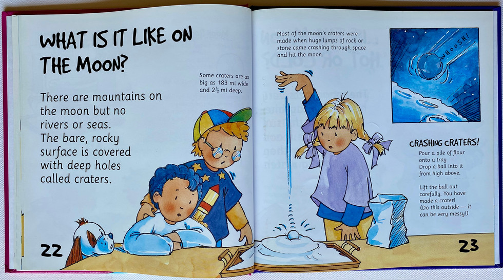
There were eight books in the series and I loved working on all of them. 'Whiz Kids' was a fantastic project that aimed to engage young readers with a range of science concepts in a fun and friendly way, and to develop their investigative skills through the use of ‘how’, ‘what’ and ‘where’ questions. The 'Whiz Kids' are a gang of six children and their dog whose actions reinforce and further expand the text. Of course, the idea and concept originated from you, David — you created and designed the series and commissioned Dr. Jen Green to do the initial background research. The series was originally named ‘Buddies', but it was changed to 'Whiz Kids' for the US market due to sensitivities around the word buddies.
Yes - Scholastic US suggested the name change to avoid any unintended associations at that time.
'Whiz Kids'

The starting point was developing what the 'Whiz kid' gang looked like. My aim was to create a diverse and inclusive group of children from different ethnic backgrounds. As these books were for a young readership age of 5 +, I wanted the artwork to be in a very simple, child-friendly style. The children’s facial features were defined with graphic marks— just dots and lines. Surprisingly, this led to an early stumbling block. Seeking guidance on reading levels, we sent the roughs of the first book, ‘Tell Me Why Rain Is Wet’ to The Reading Centre for comment and... they rejected the book outright! The Reading Centre took issue with drawings of children, they strongly advocated the use of photographs of children instead of illustrations.


That was a challenging time with a new series, and it's quickly forgotten that even simply representing children could cause problems.
It was tricky. The 'Whiz Kids' were to carry out child-friendly practical experiments to bring science to life so young readers could see science at work for themselves. An illustrated gang of kids would add much more fun and interest to the scientific content these books were to deliver - photographs would simply have turned the series into another set of ‘school books’. As I could see no other way to depict the children’s features simply, we gambled on proceeding as planned and, thankfully, no problems ever arose. The series was well-received globally, including in China.
Layout jottings & roughs


Key Stage 1 Reading
The series’ hardest challenge was to explain complex topics in very few words. The text had to be suitable for Key Stage 1 reading levels, and succinct enough to ensure clarity. The wording was repeatedly honed down to fit - each word had to add value. Betty Root, a well-known consultant on children's reading who took the books to schools, observed and reported back how the target age groups interacted with the content. This hands-on feedback was invaluable for refining the wording and illustration appeal to suit young readers’ comprehension levels. Peter Lafferty, our technical consultant, also played a crucial role in checking the content and outcome of the 'Whiz Kid’s' experiments.


It's often forgotten that books are not just made by an author and an illustrator - it's teamwork with an editor, designer, consultant and of course production - all these skills go into into making a series like Whiz Kids a success.
Yes, books are always a collaborative effort, as was recognised by a 'Whiz Kids' reviewer who wrote that “…these books have been thought out by a team who has really considered how to make some inviting information books for young children.” 'The Whiz Kids" series, were published by Franklin Watts in the UK, and by Scholastic in America, and has been in print for over twenty-five years. Its longevity shows the importance of thorough testing and careful crafting of content to ensure its correct ‘fit’ for the intended audience.
Silversmithing
In recent years you’ve shifted into working with silver, creating everything from earrings to cufflinks, and the astonishingly ambitious clock case. What drew you to silversmithing, and how does this craft compare to your previous work in illustration and printmaking?
Silversmithing felt like a natural extension of the skills I already had from etching and cutting steel plates. The precision and attention to detail required for etching really translated well into working with silver. I found that designing objects, whether it's a tea strainer or a clock case, brought together my love for drawing and my ability to work with materials in a very hands-on way. It was a new direction, but one that allowed me to merge all these skills into something functional and satisfying...as a work for hire illustrator - it can be difficult to keep being creative in an area where you were working to please clients.
Tea strainer
I was pleased with the end product as it serves its purpose well, and its simplicity of design combines crafts and functionality and is pleasing to the eye.

Silver Bowl with Frankenstein Gold Stitching
This silver bowl did start out as an idea for a ladle bowl! I adapted the problems that occurred in the making and adapted the flaws and imperfections which are now part of it's design. Overworking silver can cause small stress cracks in the metal which can, and are usually remedied. I intentionally created stress cracks and continued hammering until they developed into small tears in need of a ‘stitch in time’ repair. I began overstitching each gash with 9ct gold wire — a somewhat Frankenstein-like repair! The idea was influenced by the Japanese art of Kintsugi used in ceramics, that represents the idea that flaws and repairs can add value, and need not spoil an object.

Silver and Lapis Lazuli coffee spoons
A collection of six coffee spoons made of sterling silver and inset with Lapis Lazuli. Making six identical objects brings it's own set of problems. The back of the spoons have the so called 'rat's tail' a style that was developed in the later 17th century with a thin pointed tongue on the bottom of the bowl to reinforce the joint of bowl and handle. I cut the Lapis Lazuli into the small rectangular shapes to inset into the handle of spoons.

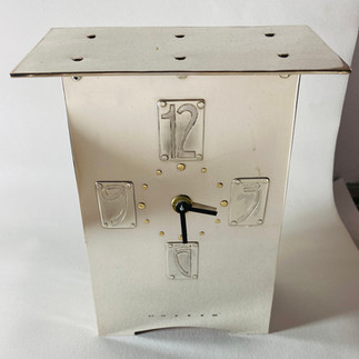
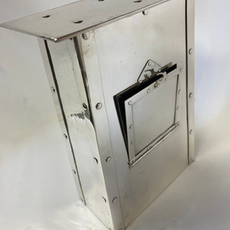
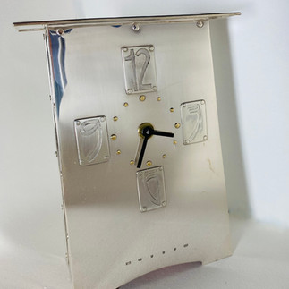
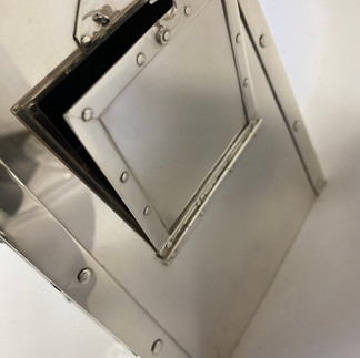
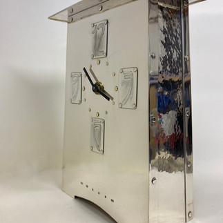
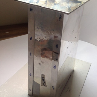
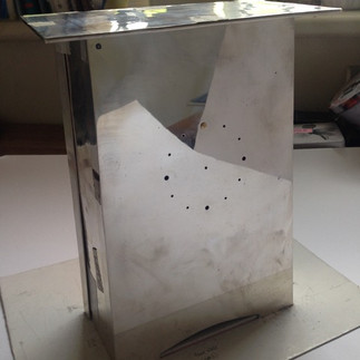
Silver case clock.
This Arts and Crafts-inspired case clock hopefully reflects time and timeless beauty. It combines precision with aesthetics, and represents the culmination of my technical abilities and my love for creating functional art. Although the shape of the clock casing looks straightforward, its construction was a long - lengthy process. It meant a lot of precise cutting, filing, drilling, hammering and angling of its many individual parts, as well as a great deal of rivet-making!

I etched the four numerals for the clock face and made 9ct gold rivets for each hour mark. At this stage, it was essentially a ‘flat pack’ nightmare, dependant on all the parts fitting, as planned. With fear and anxiety, I started riveting the case together with the first of the 76 handmade silver rivets that were to take it from 'flat pack’ to case clock. Thankfully, it worked to plan!


Silversmithing

Thanks to Shirley for guiding us through a journey back in time, reviving memories (some good, some bad) of our beginnings as freelancers when we would accept any old work that came our way. It's astonishing to think of the extent of changes in working methods — from the painstaking/laborious stipple work and manual typesetting which is now done simply in nanoseconds effortlessly through an app.
Excited to see what Shirley will do next.

Comentários