


How Does Graphic Design Influence and Change the World?
- David Salariya
- Feb 5, 2024
- 8 min read

Updated: Mar 11
Graphic Design: Changing the World One Pixel at a Time
Graphic design permeates our daily lives
Graphic design permeates our daily lives, making its presence felt and its influence can be seen in many different forms, from the logos on our morning mail to the infographics seamlessly scrolling on our phones. Graphic design is more than just a collection of images; it's a powerful tool with the ability to persuade, inform, evoke emotions, and even ignite transformative movements for change.

Political Graphic Design - Poster - Labour isn't working
A powerful tool with the ability to persuade
One example of graphic design's momentous transformative power is the 1978 political campaign poster titled 'Labour isn't Working'. It was crafted by Saatchi & Saatchi, the renowned advertising agency, as part of an advertising campaign by the Conservative Party in the UK. This poster's powerful image captures a winding queue of jobless people outside an unemployment office.The bold slogan 'Labour isn't working' takes centre stage to maker its point. The phrase 'Britain's better off with the Conservatives' is secondary so therefore, in a much smaller font size.
The success of this graphic design masterpiece by Saatchi & Saatchi lay in its effective support of the Conservative party's stance against Labour. In the May 1979 election, the Conservatives emerged victorious with a substantial 43-seat majority, ultimately leading to Margaret Thatcher assuming the role of Prime Minister. This example shows the impact that graphic design can have on shaping public perception and influencing political outcomes.
Marketing Graphic Design - Selling the potential
Design and marketing solutions
Unleashing the selling potential. Is a remarkable product sufficient to ensure its own success? Not quite. The creation of design and marketing solutions represents only the initial phase. The subsequent crucial step in most advertising briefs involves persuading the key decision-makers (your clients) that your solution stands out as the most desirable choice. Successful brands seamlessly integrate powerful, meaningful, and inspirational graphic messages into their marketing strategies. These messages are designed to resonate with their target audience and complement exceptional products and services that meet expectations, exude credibility, influence and foster trust.
Graphic Design Influences
Imagine a billboard introducing a sleek, cutting-edge phone. The meticulously designed image goes far beyond mere visual appeal; it subtly conveys the promise of sophistication and innovation that steer and entice you towards the 'buy now' button. Good graphic design harnesses the elements of colour, typography, and composition to elicit specific emotions and desires, rendering products to be utterly irresistible.
How Does Graphic Design Influence and Change the World?
Top advertising campaigns
Hoover - It Beats…As it Sweeps…As it Cleans (1956)
De Beers - A Diamond is Forever (1947)
US Military - I Want You (1916)
Volkswagen - Think Small (1959)
Google - Year in Search (2017)
Nike - Just Do It (1988)
Dos Equis - The Most Interesting Man in the World (2006)
Pepsi - Is Pepsi OK? (2019)
Apple - Get a Mac (2006)
KFC - ‘FCK’ (2018)
Coca-Cola - Share a Coke (2011)
Red Bull - Stratos (2012)
Procter & Gamble - Thank You, Mom (2012)
Always - #LikeAGirl (2015)
Metro Trains – Dumb Ways to Die (2012)
The Last Word
Graphic Design - Logos
A visual declaration of identity
The logo serves as the most straightforward form of graphic communication. It acts as a signature - a visual declaration of identity. Whether it's the ornate calligraphic cypher of King Charles III, the universally recognised peace sign, the controversial Nazi swastika, or the iconic symbols representing corporate giants like Coca-Cola, Nike, McDonald's, Amazon, and Google, logos play a crucial role in conveying identity.
Logos come in various forms: some are typographic, as exemplified by TED, CNN, and LOUIS VUITTON, while others take the shape of distinct images or symbols. In cases like Apple, the logo's symbol carries a literal meaning.
Occasionally, the image reflects something real; the Lacoste crocodile finds its origin in the personal nickname given to the brand's founder, René Lacoste. The Adidas three stripes started as decorative elements, as did the Bass Ale red triangle which dates back to 1777 and is considered to be one of the world's oldest logos. The red triangle, associated with Bass Ale, became the UK's first registered trademark, symbolising the export of its pale ale throughout the British Empire.


Graphic Design - Scientific Papers
Simplifying Complexity
Ever deciphered a scientific paper with indecipherable jargon? Enter the graphic designer! The designer can transform complex information into understandable visuals, like flowcharts and illustrations, making dry data dance before your eyes and make your brain take in the information. That is just one of the many ways that graphic design influences decision making.
Suddenly, understanding that research paper feels like cracking a secret code.
To effectively convey complex scientific ideas through graphic arts, you need to start by understanding your audience. Identify who you're addressing and what information is essential for them. Tailor the level of detail, style, tone, and format of your graphic arts according to your audience's needs. A graphic for a scientific journal may require technical terms, data, and references, while one for a general audience can be more straightforward. Likewise, a graphic for a children's book may benefit from vibrant, playful, and simple images, contrasting with the more formal approach suitable for a professional conference.
Graphic Design - Beyond Aesthetics
Visual storytelling
The power of graphic design goes beyond the function of triggering laughter with witty illustrations or pulling at heartstrings with poignant imagery. Remember that cinema poster or the playful animation that brightened your day? These emotions, carefully crafted through visual storytelling, are the hallmarks of truly powerful design.


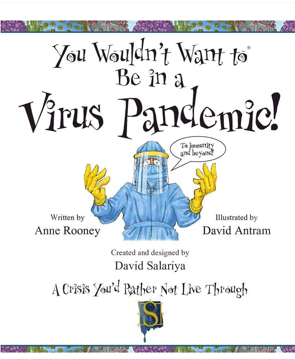
Ronald Searle’s drawings for the St Trinian's cartoon strips and the film poster's typography greatly influenced me in 1999 when I created the 'You Wouldn't Want To be... series'. When I was working out the design of the spreads in these books, my inspiration was based on the dastardly girls of St Trinian’s, and also Britain’s naughtiest schoolboy, Nigel Molesworth from the Curse of St Custard’s School. These characters encapsulated the style and humour I wanted for my books. In a way I wanted to evoke the "wonderful indiscipline of the tearaways and the debauched indifference of the staff" as per the Radio Times Film Guide review of the 1954 film 'The Pure Hell of St Trinian's'. I'd also had the idea of using the format of a cookery book for the sequences of how to make an Egyptian mummy so ... what do you need...ingredients! I decided to write these books in the first person, hence as an Ancient Egyptian - it is you who is about to drop dead and be mummified. Admittedly it is easier for me to design projects when writing them too - no arguments with writers!
(I wrote that particular title with the pen-name David Stewart as David Salariya I was designing.)
All title sequences designed by Ronald Searle
By Shot, Drawn & Cut
Graphic Design - Educating by stealth!
The elements that a young reader would associate with 'fun'!


My page design and concept for the 'You Wouldn't Want To Be...' series set out to create information books with all the elements that a young reader would associate with 'fun', and with the familiar styling of comics and cartoons. Anything remotely looking 'educational' is a real turnoff to most children.The style of the heading fonts, although not the most legible, were chosen to create a feeling of slight anarchy. I also introduced speech bubbles to deliver added information and humour specifically because children always
want to know "what's in a speech bubble?" I chose to use dropped caps as an indicator of where the main text starts - in this series the dropped cap is in a font called 'Bludgeon'.
David Antram's illustrations perfected the look that I wanted - to educate by stealth!.
My choice of styling and design remained in use consistently throughout all editions, both at home and abroad. The 70 + titles of the 'You Wouldn't Want To be...' series were published globally between the years of1999 to 2022.
Graphic Design - We are Power
World-Changing Posters
The power of graphic design extends far beyond commercial interests. Imagine a world where social justice campaigns use striking visuals to ignite change, or environmental movements employ powerful imagery to raise awareness. Graphic design becomes a weapon in the fight for a better tomorrow, amplifying voices and driving action.

May 3rd, 1968, Paris. A student meeting at the Sorbonne protesting Nanterre University’s closure triggered a clash with police. Rumours of an impending right-wing attack fueled tensions, leading authorities to call for a controlled student exit. However, the students were promptly arrested, sparking outrage and a growing crowd on Boulevard St Michel. This incident, alongside subsequent nationwide strikes, severely challenged the French government's legitimacy. The crisis escalated further when President de Gaulle, without informing his own Prime Minister, secretly consulted a military general in West Germany, raising fears of army intervention.
Graphic design is not just about making things and ideas look aesthetically pleasing; it's about making ideas matter.
Infographics
Making complex information understandable
Graphic design also impacts by making complex information understandable and attractive by the way its layout can inform and evoke emotions which can drive change. This is shown in the brilliant infographic on ivory poaching by Adolfo Arranz.

This infographic was created by Adolfo Arranz from The South China Morning Post.
He is a Senior Graphics Editor at Reuters and has been Deputy, and then Creative Director at the South China Morning Post in Hong Kong and Mediacorp in Singapore.
Next time you see a well-designed book, poster, website, or a perfectly designed wine label - take a moment to appreciate the artistry at work. It's more than just pencil stokes and pixels; it's a silent conversation, a subtle nudge, a whisper of emotion that can shape our perceptions, influence our choices, and maybe even change the world...
one pencil line or pixel at a time.
The Salariya Book Company was a hub of creativity, inspiration, and exciting discoveries. Focused on young readers aged 3 to 15, our children's imprints: Book House, Scribo, and Scribblers - offered engaging, informative, and enriching titles designed to spark the imaginations and passions of the next generation. With a strong emphasis on non-fiction, interactive learning, and art-based activity books, The Salariya Book Company helped foster a lifelong love of reading and curiosity.
So How Does Graphic Design Influence and Change the World?
Graphic design is far more than making a design look pretty - it is a powerful force that shapes perceptions, drives change, and influences the world in profound ways. From political campaigns that sway elections, like Labour Isn't Working, to advertising strategies that define entire industries, such as A Diamond is Forever, design is at the heart of how messages are communicated and received. It enhances marketing, making products irresistible, and simplifies scientific research, transforming complexity into clarity. Logos act as instant identifiers of brands, movements, and ideologies, while posters, infographics, and visual storytelling spark cultural shifts, ignite activism, and educate by stealth. Whether guiding purchasing decisions, preserving historical narratives, or amplifying voices in social justice movements, graphic design is a silent yet omnipresent force that informs, persuades, and inspires. In an increasingly digital world, where images and visuals dominate communication, the influence of graphic design is more profound than ever - shaping minds, industries, and societies one pixel, one poster, one idea at a time.
David Salariya


Comments